Product update: June 2020
This month we have worked on a bunch of improvements and some fancy features. Let us give you a quick overview so you can keep providing the best learning experiences – no matter what.

What’s new?
Make course tiles engaging by adding cover images in the authoring tool and Easygenerator for Learners; easily find the course you are looking for with the Tree of tags; Images will automatically have the right size on any device with our improved Hot spot content block; Communicate smoothly with co-authors with enhanced comment indicators; Tailor course interfaces with the Chinese languages in Easygenerator.
Course cover images: create engaging course tiles
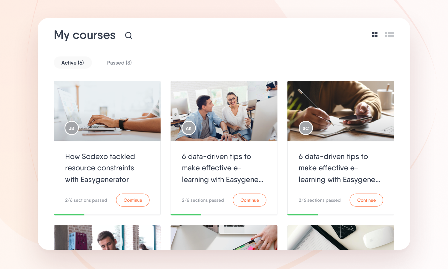
Do you want to make your training stand out more and speak to your learners on their dashboard? As of this month, you can do that thanks to our new addition: course cover images. Course cover images capture your learners’ attention and engage them from the start.
How to add course cover images
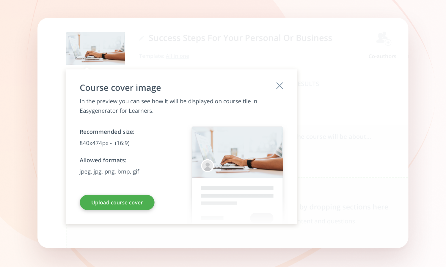
When you make a course, you can click on the icon next to the title of the course and upload an image. Before publishing the course, you can use the preview option to see how your course will be displayed on the dashboard. This helps you to see if the chosen picture matches your course. You can easily try out different images until you find the one that reflects your content best.
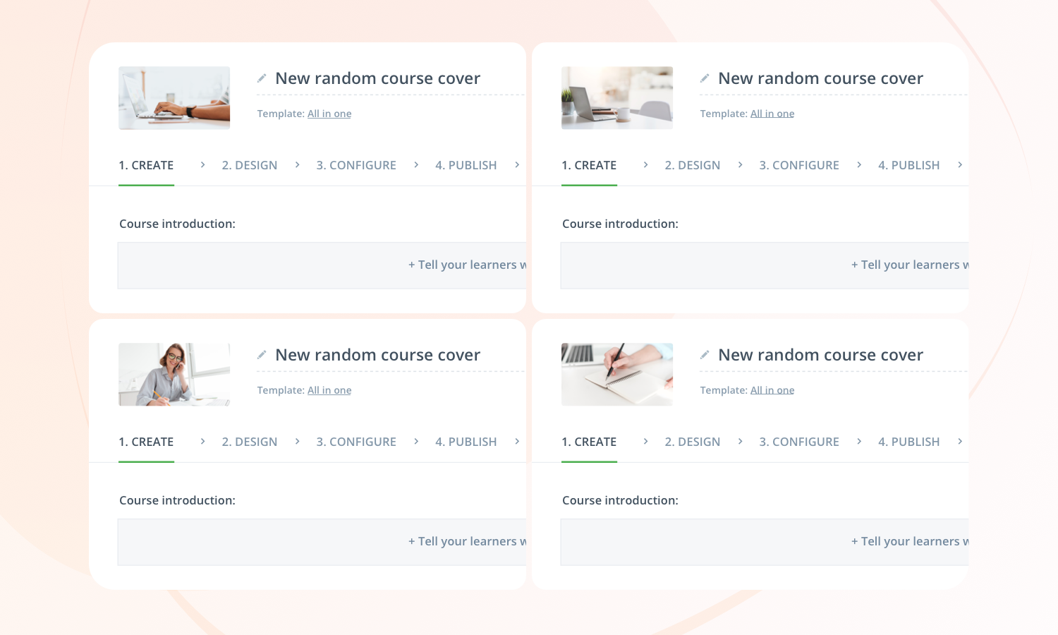
Don’t have an image at hand? That’s alright. When you create a course, a high-quality image will automatically be added as a cover, ensuring your course tile will always look attractive for Learners.
Choose the right authoring tool
Our experts created the ultimate guide to help you select an authoring tool that fits your organization’s needs.
Tree of tags: find courses in no time
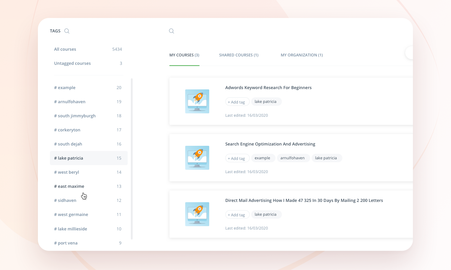
We’ve just made searching for courses a whole lot easier and faster by creating a sidebar for your tags. With the sidebar, you can easily look for your tags to find a batch of courses or a specific course with that exact tag. Is your list of tags so long that it’s hard to find the right one? Use the searching option to find them in the blink of an eye.
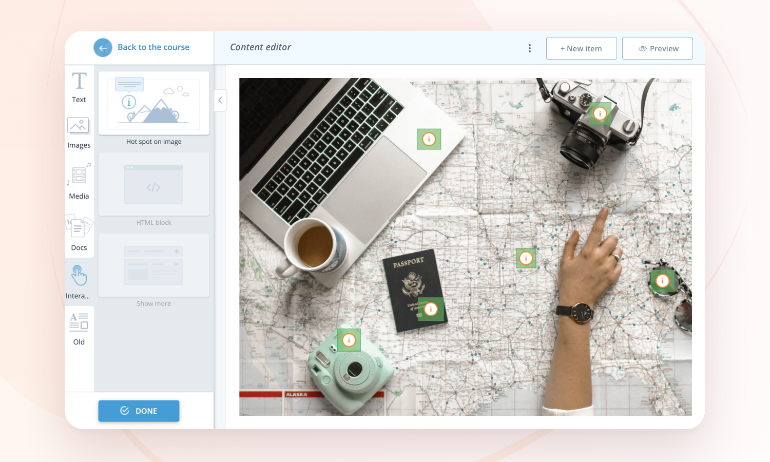
Hot spot content block: images always fit
We have completely re-architected and revamped our Hot spot content block to ensure you have a smoother experience when you create interactive content. From now on you can add any picture with any size to this content block, without having to adjust the image size to make it fit. Our tool will automatically make sure your image has the right size on any device. In other words: all you have to think about is what image you want to use, and we will make sure it looks good.
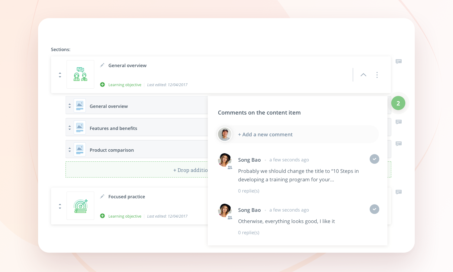
Comments for co-authors bubble counter
Collaboration with your co-author should be smooth, period. That’s why we make communication in our tool as easy as we can. With this new feature, you will never miss your co-author’s comments. Bubbles next to your course items will show you there is a new comment on that specific item – and they’ll indicate the number of comments. This helps you to stay updated all the time. Try it out and see how this small change can benefit your collaboration with co-authors.
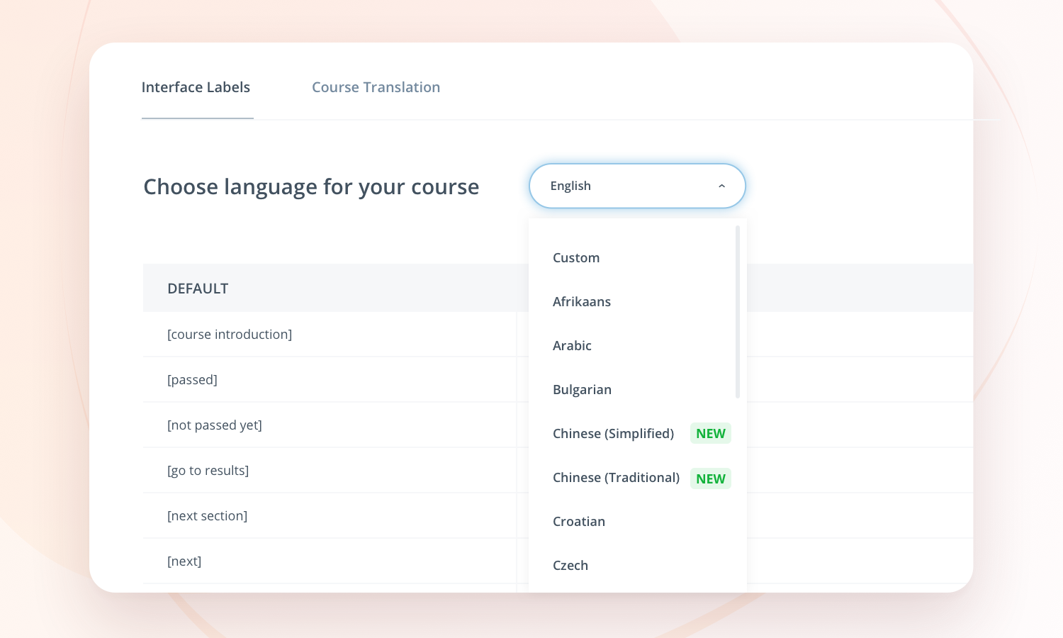
New languages: Traditional and Simplified Chinese
Over 1.2 billion people speak Simplified and Traditional Chinese. These languages are now a part of our interface, so you can tailor your course and keep creating engaging content for your learners.
What’s next?
Want to know what’s next? All we can tell you is that next month’s updates will be great too. We are working on huge additions to the All in one template that will give you the possibility to assess your learners’ knowledge even better. Getting excited? So are we.
Check our previous updates so you won’t have to miss out on exciting features and improvements.


